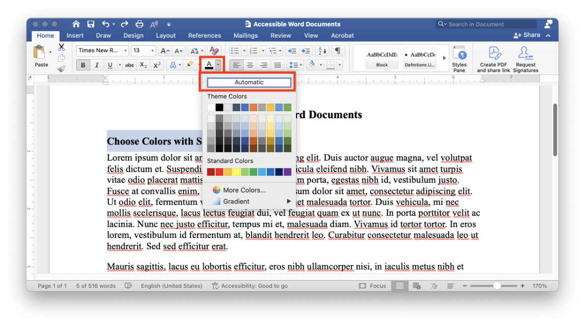
Ensure text has strong contrast against the background color. The simplest way to do this is to choose the Automatic setting for font colors. This makes it easier for everyone to easily make out your text, and it also helps make sure the text displays well for people who use high contrast mode.

You can choose other colors, but you must ensure text in your document has sufficient color contrast. In general, text needs to have at least a 4.5:1 color contrast ratio against the background color. Large text (at least 18 point or 14 point and bold) only needs to have at least a 3:1 color contrast ratio. These requirements for minimum color contrast come from the Web Content Accessibility Guidelines (WCAG).
You can use tools like the WebAIM Contrast Checker or SCU’s Accessible Brand Color Combinations page to calculate appropriate color values. Additionally, Word’s built-in accessibility checker may flag text with insufficient contrast.