When you use proper heading styles, all users can more easily navigate your document by jumping between headings. Without heading styles, screen reader users won’t be able to effectively navigate your document. Additionally, heading styles make it easier for you to change how your headings look, and heading styles allow you to automatically add a table of contents.
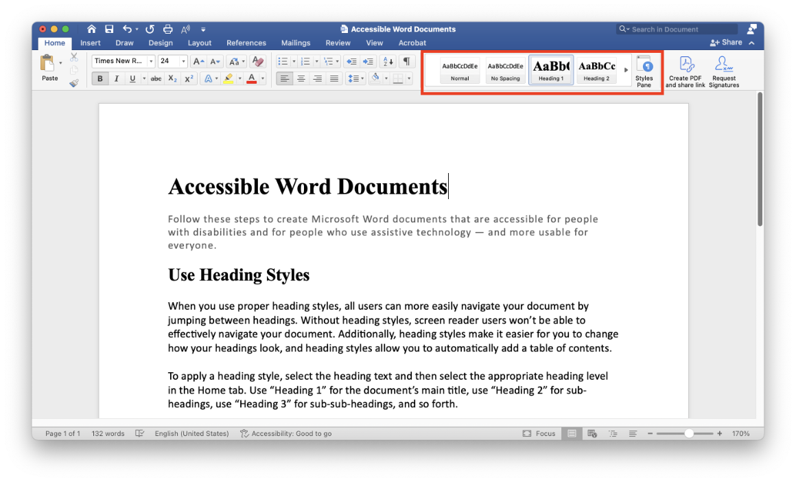
To apply a heading style, select the heading text and then select the appropriate heading level in the Home tab. Use “Heading 1” for the document’s main title, use “Heading 2” for sub-headings, use “Heading 3” for sub-sub-headings, and so forth.
You can have up to six levels of headings. Microsoft Word may allow you to have further levels of heading styles (Heading 7 and beyond), but these are not supported by screen readers, so try not to go past Heading 6.
Note that screen readers treat the “Title” style as a Heading 1. We recommend avoiding the Title style and using Heading 1 for the document’s main title. Remember that you can style headings to look however you choose.
We recommend using styles to structure your documents, and you can create different styles for your different formatting needs. Typically only heading styles are relevant for accessibility, but styles do have another implication for accessibility: they can help you avoid blank lines.
Try not to leave blank lines in your Word document, since screen readers may announce these as “blank”. It is not a major issue, but it is potentially confusing, and it can make it more challenging for screen reader users to effectively navigate your document. For each style, you can set custom options for line and paragraph spacing. This way, you can visually keep that extra space between paragraphs while making a more usable experience for everyone.
- Add a heading in a Word document (Microsoft Support)
- Improve accessibility with heading styles (Microsoft Support)
- Customize or create new styles (Microsoft Support)
- Use the Navigation pane in Word (Microsoft Support)
- Insert a table of contents (Microsoft Support)
- Use Styles to Create Headings (Section508.gov)